Complete and turn into the DropBox:
folder:
lastname_e7
main image file:
lastname_e7.psd (layers)
lastname_e7.jpg
(flattened by default)
assets folder:
all source images and other files (such as special font files)
Size:
6" x 4" @ 300 ppi
Use only the following text (DO NOT USE ANY OTHER TEXT):
Sundance Film Festival
2019
Jan 24-Feb 3
Park City, Utah
You can consult the color groups from the "Color Combinations" pdf in the handouts folder on the Server.
You may use print res photographic images and/or color & shapes in your layout.
Font Face will be your choice. You can download and use unique fonts or use the default loaded fonts on the computers.
WARNING: Convert your text to shape before turning in your work.
Design Suggestions:
* Avoid obvious design choices such as: images directly related to "film" (i.e., film with sprockets, cameras),
or to "sun" or "dance" or images of Native Americans. Try designing so that your layout can stand on its own.
* Avoid overly designed Font Faces. Remember that your audience needs to read the information in your layout and not struggle or be confused.
Links:
Visit this link for inspiration:
http://www.sundance.org/store/
Past Posters for Sundance:
http://store.sundance.org/collections/vintage-posters
Posters by Sean Adams
Design by Paula Scher
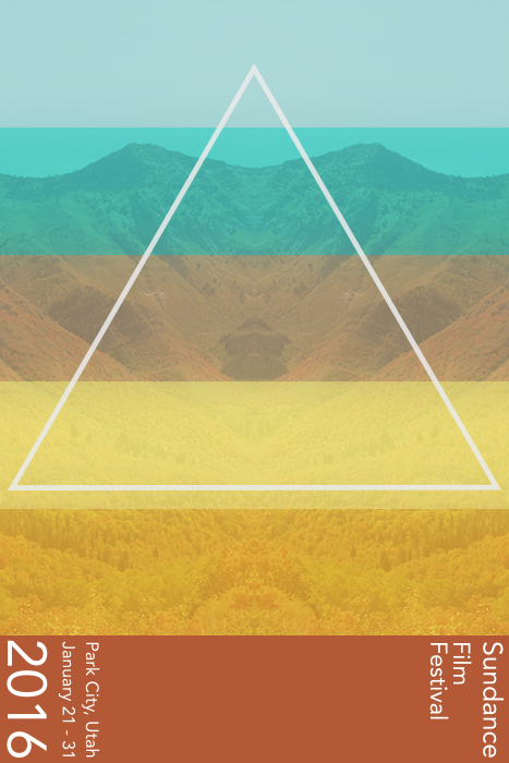
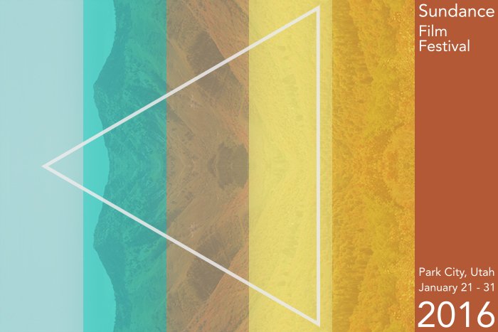
Instructor Example (from the 2016 festival):
(Designed to be viewed both horizontally and vertically)